


Contemporary Typography Art Prints
Designed for walls that like a little conversation
With typographic structure and contrasting palettes, OH, NO and I’M OK can be styled separately or together. OH, NO adds a brighter, pop-forward lift, while I’M OK brings a calmer, more grounded balance. Hung side by side, they create a stronger sense of rhythm, contrast, and play.


Choose Your Mood
OH, NO
Bright, playful, and instantly eye-catching — a strong graphic accent for walls that need more lift.

Choose Your Mood
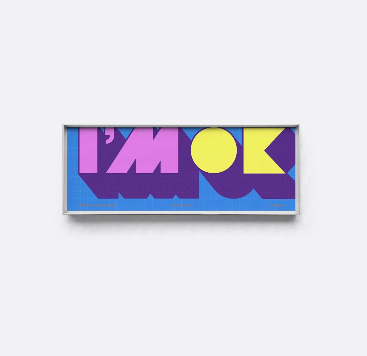
I’M OK
Calmer, deeper, and more grounded — a softer visual anchor with a more balanced mood.

Better Together
Buy one if it fits your space. Pair both if you want a fuller, more layered statement — with added bundle savings.
The 3rd Gallery™ vs Other Brands
Not all wall art is made to feel at home. Ours is designed as a finished piece — thoughtfully framed, visually distinctive, and made to sit naturally in curated interiors.
| Feature | The 3rd Gallery™ | Other Brands |
|---|---|---|
|
✨
Distinctive design language
|
✔ | ✖ |
|
🖼️
Museum-grade print quality
|
✔ | ✖ |
|
🪞
Framed and ready to hang
|
✔ | ✖ |
|
🏠
Made for curated interiors
|
✔ | ✖ |
|
🌍
Free worldwide shipping
|
✔ | ✖ |


Quality Matters
Made with gallery-minded materials, this piece is designed to look refined now and stay beautiful over time.
- Archival pigment printing for rich, lasting colour
- 280g acid-free cotton paper with a premium tactile feel
- Slim aluminum frame in a clean contemporary profile
- Ultra-clear acrylic front for clarity and everyday durability
From print surface to frame finish, every detail is chosen to feel clean, lasting, and thoughtfully made.

Collaboration
Created in collaboration with MUOMUO Design Studio — a small practice drawn to colour, grids, and expressive typography.
You May Also Like
-
Bauhaus Rhythm — Red Pencil Framed Print
Regular price $150.00Regular priceUnit price per -
Pop Tomato — Mid-Century Graphic Print in Handcrafted Teak
Regular price $200.00Regular priceUnit price per -
Bold Typographic Art That Makes People Look Twice
Regular price $150.00Regular priceUnit price per -
STAY — Framed Bauhaus Typography Art Print
Regular price $150.00Regular priceUnit price per -
The Little Wanderer — Serene Pasture Art Print
Regular price $100.00Regular priceUnit price per -
Rain, Bucket, and Silence — Framed Minimalist Blue Art Print
Regular price $200.00Regular priceUnit price per


